Introduction
Setting the Tone – The Founder and Director of FlySocials UK reached out to me through a recommendation of a previous client that I built and launched a WordPress website for. At the time, it was the most technologically advanced site I’d ever built – and this was a theme I intended to continue.
They hadn’t previously had an online presence in website form and needed something that would convert potential clients into real, thriving working relationships.
Marketing agencies are fast-growing industry and my client intended to capitalise on that.

The Brief
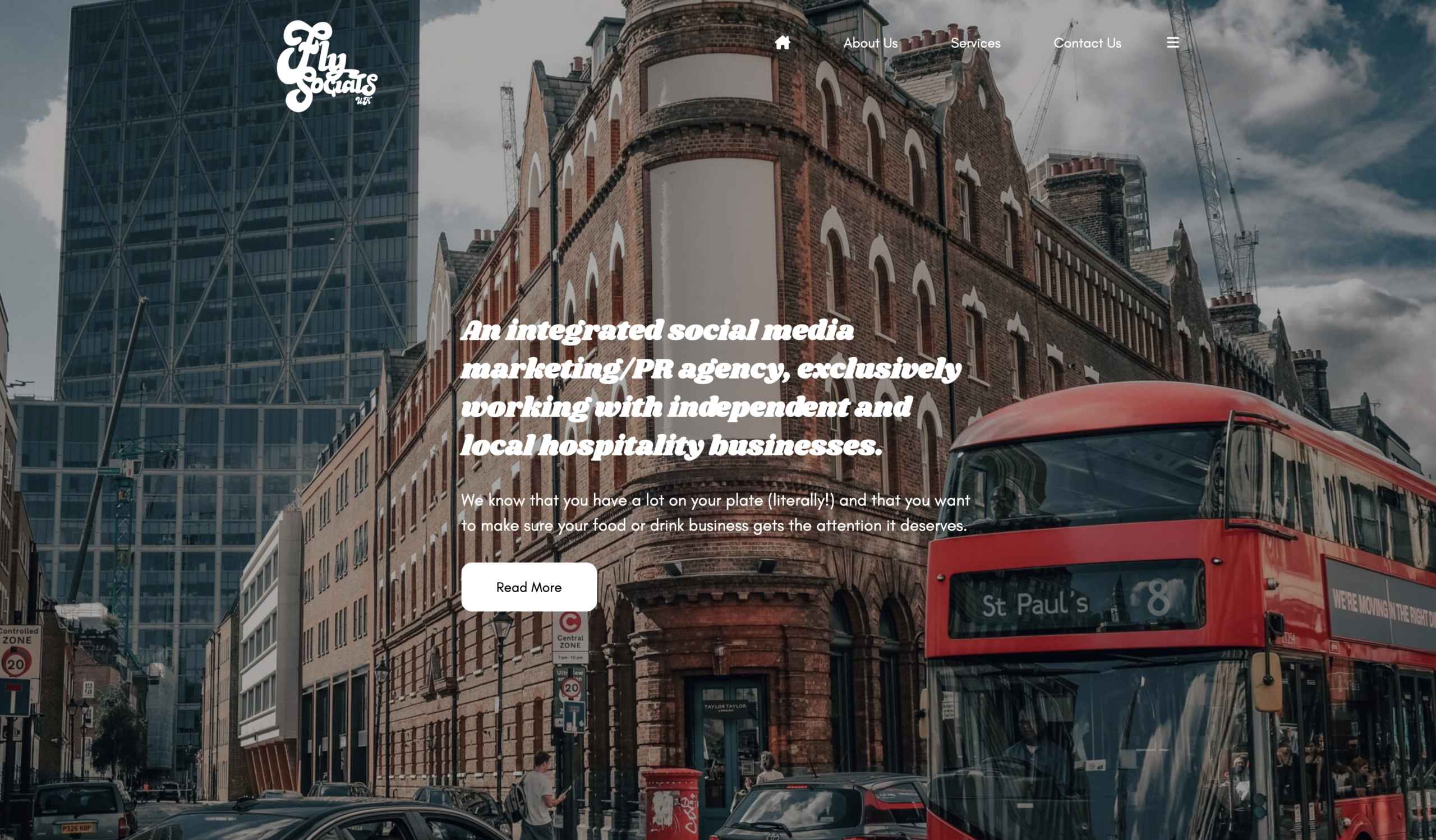
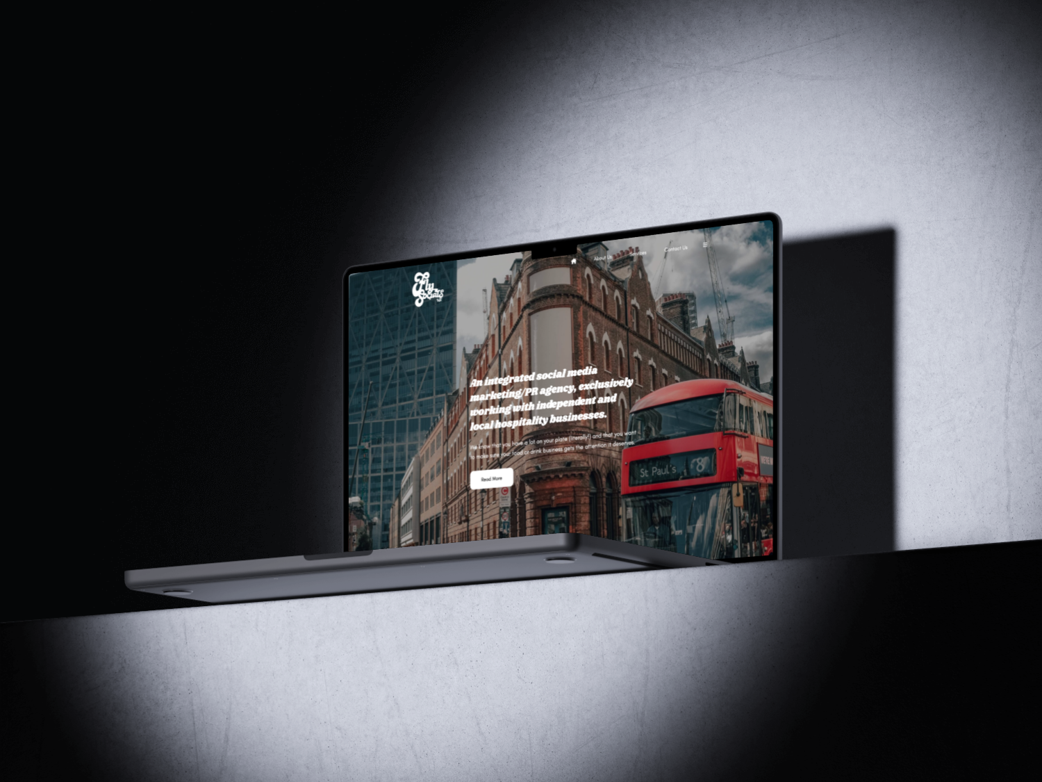
The brief was simple – Create a website that feels captivating, but direct and straight to the point.
The Challenge
They already had an existing website built by another developer, but the client was dissatisfied with the overall quality of the site. They haven’t had any real form of social presence outside of Instagram and direct face-to-face marketing. This website needed to not only bridge that, but also appeal to a wider audience. (and most importantly put a smile on my client’s face.)
The Direction
As I was given the reins to control the majority of the creative direction, I opted to go with something with more ‘personality’ as opposed to a generic corporate website.
Design
Designing for Calm – The design language was built to reduce friction and let users feel at ease from the moment they land.
Colour & Atmosphere
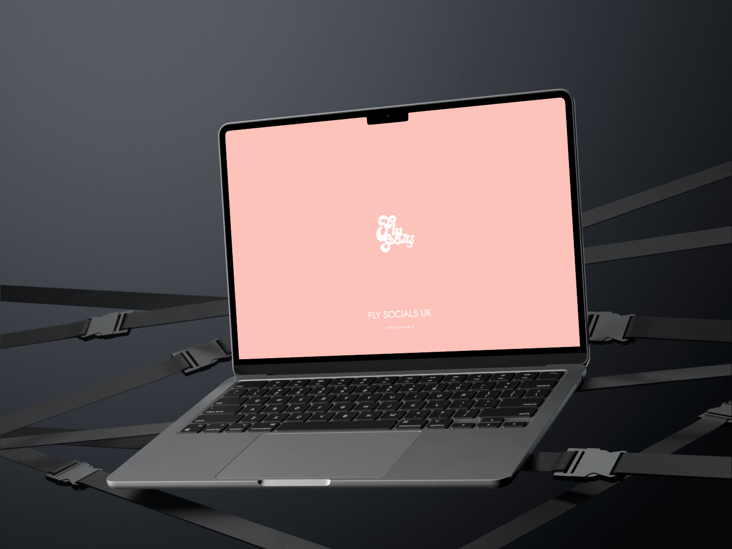
I opted to use a variety of playful colours to brighten up the tone of the site. A lot of the colour choices were influenced by the content they already had on their Social Media, so it was a matter of colour-picking the images that complement the site the most.
Typography
I decided to have all the heading fonts mimic the logo. Thankfully Google Fonts had one that perfectly fit the job – the ‘Shrikhand’ font. It helps to carry the informal tone of the site. Then I paired it with the ‘Glacial Indifference’ font. Smooth, sleek, modern but more importantly, readable.
Layout
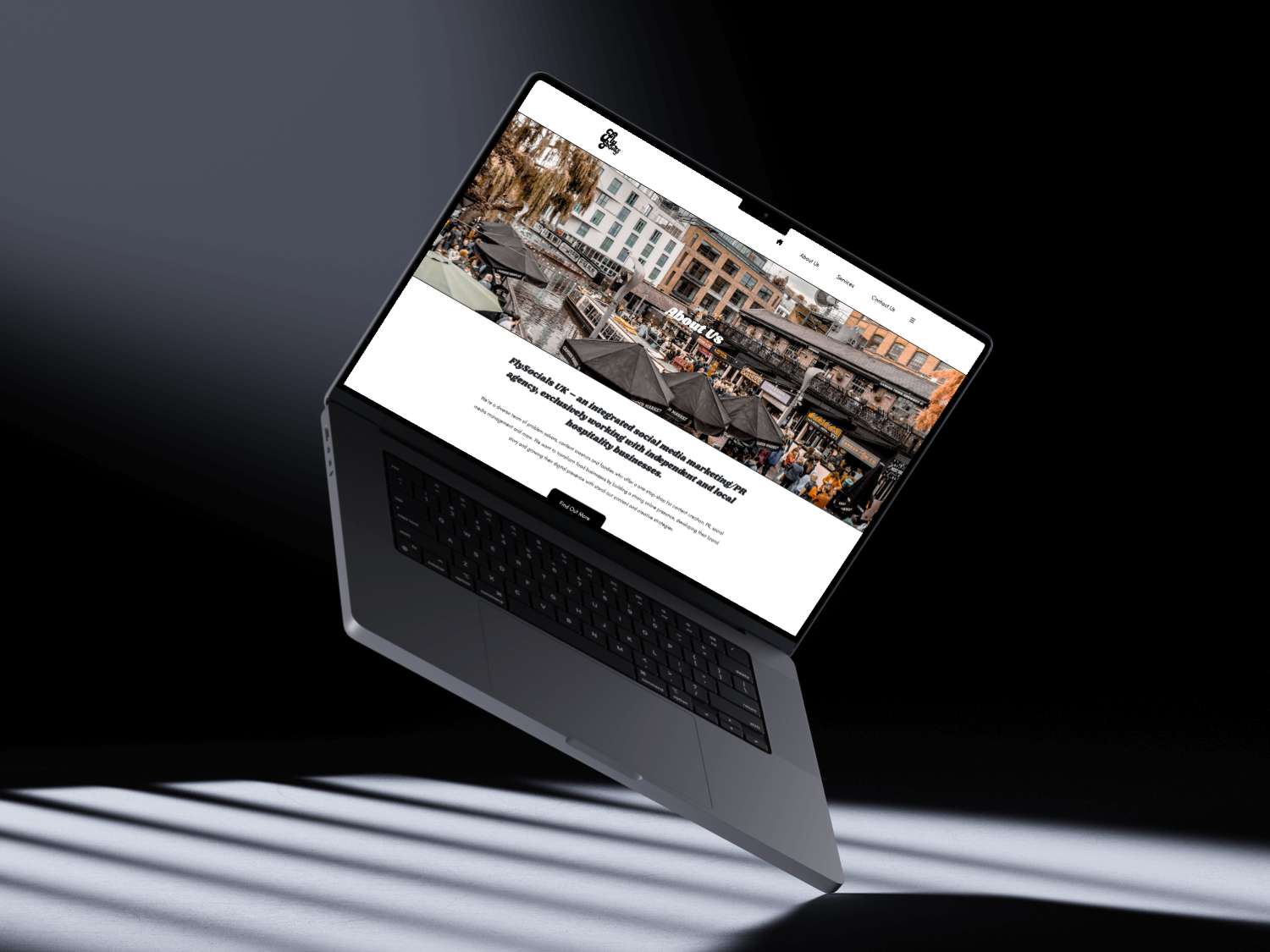
As the site was going to be information-heavy, a lot of white space and intentional use of enlarged, striking imagery were used to visually balance everything out.
Development
Building the Experience – The site was developed with performance, flexibility, and longevity at its core.
What was built
A fully custom-built WordPress experience with modular sections and reusable components, optimised for desktop, tablet and mobile.
How it was built
The whole site was derived from a Bootstrap 5 Starter theme template, which includes the build process I need to speed up the development of the site. Once all the fundamentals of the site were built (integral layouts, fonts, I could then focus on making refinements to the custom built theme.
Key Consideration
Everything needed to appear clean and purposeful. It also needed to perform well on mobile, as it was anticipated that most traffic would be coming from mobile devices.
- HTML
- CSS/SCSS
- PHP
- JS
- WordPress
- NPM
Launch
A Confident Launch – The finished site reflects the brand’s values – calm, professional and quietly confident.
Objectives Achieved
- Clear Brand Positioning
- Frictionless User Journey
- Distinct visual identity within the market
Looking Ahead
The platform is built to scale, supporting future content, integrations, and service growth without redesign. The site has undergone CMS changes that I was not required to be involved with, as it was straightforward enough for the client to navigate.