01 / 04 — Revive Sports Therapy
A focused proof of concept
A premium homepage concept for a sports therapy studio.
The opportunity
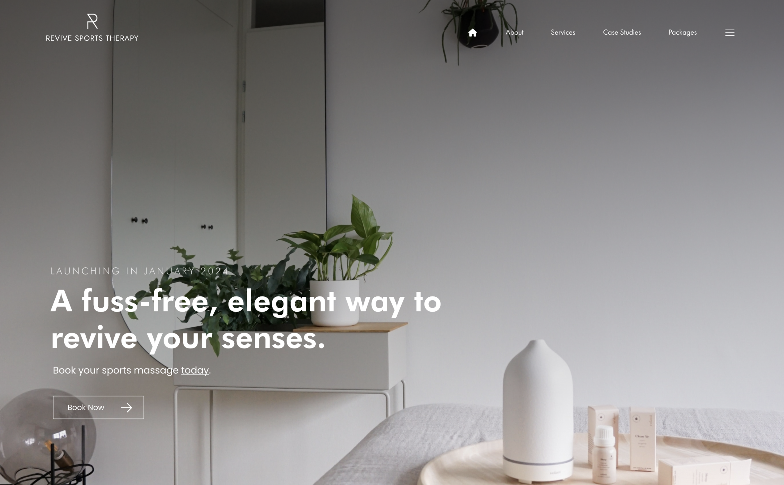
Revive Sports Therapy needed a visual direction that could translate the studio’s identity into a website. I focused the initial work on the homepage: a compact proof of concept that could demonstrate the look and feel before a wider site was commissioned.
The design was completed in two days and the homepage was developed within a week. This was a deliberately limited scope, with the emphasis on making one page feel considered and coherent.
Reading the existing identity
I drew the fonts, colours and brand cues from the studio’s social presence and logo. The aim was an upscale, clean presentation that felt connected to the physical studio, rather than a generic fitness template.
02 / 04 — Revive Sports Therapy
From brand cues to a page
A clear visual hierarchy, shaped in Figma.
Designing the experience
I created a high-fidelity Figma design to establish the homepage’s hierarchy and aesthetic before development. Typography, spacing and imagery worked together to give the service a premium but approachable presence.
Using the existing brand as a starting point kept the concept recognisable while giving it a more complete digital expression.
03 / 04 — Revive Sports Therapy
Built to be maintained
A WordPress foundation for a growing business.
Choosing the platform
I selected WordPress with future publishing in mind. The studio’s growing social presence suggested that services and content would need to change regularly; the website should be manageable without editing code.
Development took place in LocalWP. The homepage translated the agreed visual direction into a working concept, with the platform ready for further content if the project progressed.
04 / 04 — Revive Sports Therapy
Where the concept stands
A completed homepage exploration, rather than a launched full website.
Outcome and scope
The client subsequently rebranded, so this work remained a proof of concept. It should be viewed as a design and development exercise for the original identity, not as the studio’s current public website.
The project demonstrates how a focused brief, existing brand material and a short delivery window can produce a tangible direction for a larger site.